Major players in the industry, such as Adobe and Figma, understand this and offer robust tools to help designers apply color theory effectively. But it’s not just about tools; it’s about knowing how to use them strategically to influence user behavior and improve engagement.
How Color Influences User Behavior
Color has a psychological impact that can influence users’ perceptions, emotions, and behaviors. For example, a study by the Institute for Color Research revealed that people make a subconscious judgment about a product within 90 seconds of initial viewing, and up to 90% of that assessment is based on color alone. This is why companies like Spotify and Slack put significant effort into selecting their color palettes. Spotify’s use of green symbolizes growth and harmony, while Slack’s colorful logo reflects creativity and collaboration. Designers need to be aware of these psychological triggers when choosing colors for their projects.
The emotional responses to color are also culturally specific. For instance, while white is often associated with purity in Western cultures, it symbolizes mourning in some Eastern cultures. Therefore, understanding your target audience’s cultural background is crucial when deciding on color schemes. When designing for a global audience, tools like Adobe Color can be invaluable. It offers options to explore color harmonies and ensure that your palette resonates with users across different cultures.
Current Trends in Color Usage
One of the emerging trends in color usage is the shift towards minimalistic, monochromatic palettes. Brands like Apple have popularized this trend, using subtle shades of grey, white, and black to create a clean, sophisticated look. Another trend is the use of bold, vibrant colors to grab attention and convey energy. Companies like Airbnb and Dropbox have embraced this approach, using bright, contrasting colors to make their interfaces more engaging and memorable. These trends are not just about following the crowd; they reflect a deeper understanding of how color impacts user experience.
Another notable trend is the increasing use of gradients. Once considered outdated, gradients have made a strong comeback, thanks in part to Instagram’s rebranding. The platform’s use of a gradient logo has set a trend that many designers are now following, blending colors to create depth and dynamism in their designs. Tools like Figma and Sketch offer easy ways to create and apply gradients, allowing designers to experiment with different combinations until they find the perfect blend.
The Role of Color in Accessibility
Accessibility is another critical aspect of web and app design that color theory plays a significant role in. Ensuring that your color choices are accessible to all users, including those with color vision deficiencies, is not just good practice; it’s a legal requirement under the Web Content Accessibility Guidelines (WCAG). According to the CDC, approximately 8% of men and 0.5% of women have some form of color blindness. Designers can use tools like Stark, a plugin for Sketch, Figma, and Adobe XD, to check their color choices against accessibility standards. Stark helps designers simulate color blindness and ensure that their designs are accessible to all users.
Moreover, contrast is a crucial factor in accessibility. WCAG recommends a minimum contrast ratio of 4.5:1 for normal text and 3:1 for large text. High-contrast color schemes not only make content more readable for people with visual impairments but also improve readability for all users, particularly in low-light conditions. This is why many designers opt for dark mode options, as it reduces eye strain and improves accessibility.
Tools and Resources for Accessible Design
Several tools can help designers create accessible color palettes. Contrast Checkers, like the one offered by WebAIM, allow you to test the contrast ratio between foreground and background colors. Another valuable resource is the Color Contrast Analyzer by Paciello Group, which provides a simple interface to test color combinations. These tools are essential for any designer committed to making their web and app designs inclusive and user-friendly.
Another important resource is the Adobe Color Accessibility Tools, which help designers ensure that their color schemes are accessible to users with visual impairments. These tools offer a range of features, including simulations of how your colors will look to people with different types of color blindness and suggestions for alternative color combinations if your current palette is not accessible. These resources make it easier for designers to create products that are both beautiful and accessible.
Best Practices for Applying Color Theory in Design
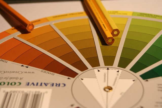
Applying color theory effectively requires a blend of creativity, knowledge, and practical application. One of the key strategies is to always start with a color wheel, a tool that allows you to see how colors relate to each other. Tools like Adobe Color make it easy to generate harmonious color schemes by selecting complementary, analogous, or triadic colors. These predefined color harmonies can save time and ensure your design is visually appealing. Another important practice is considering the emotional impact of your color choices. Colors like blue evoke feelings of trust and stability, making them ideal for financial institutions. Red, on the other hand, is often used in call-to-action buttons because it conveys urgency and excitement. By using contrasting colors, you can highlight buttons, links, or important messages, making it easier for users to navigate your design.
Some practical tips include:
- Use contrasting colors to make important elements stand out
- Test your color choices for accessibility using tools like Stark
- Experiment with different combinations to see what resonates best with your audience
These practices help ensure that your design is not only visually appealing but also functional and user-friendly.
Examples and Resources
For instance, Dropbox’s recent rebrand saw a shift from its previous blue-heavy palette to a more diverse range of colors. The new palette reflects the company’s shift towards creativity and collaboration, with colors that evoke energy, diversity, and inspiration. Another example is Google’s Material Design, which uses a well-defined color system to create a consistent and intuitive user experience across all its products. These examples show how thoughtful color application can enhance brand identity and improve user experience.
For further reading on color theory and its application in design, visit Adobe’s comprehensive guide at https://www.adobe.com/creativecloud/design/discover/color-theory.html. Additionally, a valuable resource is Nielsen Norman Group’s article on color and usability, which you can find at https://www.nngroup.com/articles/color-and-usability/.
Finally, remember that color is not just about aesthetics. It’s a powerful tool that can influence user behavior, improve accessibility, and reinforce brand identity. By understanding and applying color theory, you can create designs that are not only visually appealing but also functional and inclusive.