 Riley Clark
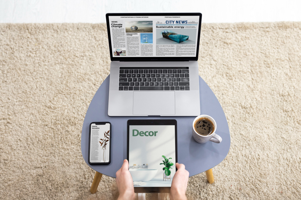
Designers are now grappling with the need to create adaptable layouts that can accommodate an ever-growing array of screen dimensions, from the minuscule displays of smartwatches to the sprawling real estate of 8K televisions. This shift is not just about resizing elements; it’s about rethinking how content is presented, ensuring readability, and maintaining engagement across every possible screen size. The tools and methodologies we used just a few years ago are rapidly becoming outdated. Today, it’s crucial to stay ahead of the curve, incorporating the latest trends and best practices to create truly responsive designs. A great resource to keep up with these trends is the Awwwards blog.
Flexbox and Grid Layouts
To keep up with these changes, web designers are increasingly turning to CSS frameworks like Flexbox and Grid, which offer powerful tools for creating flexible and dynamic layouts. Flexbox, for instance, is ideal for developing components that need to maintain proportional sizes, even when the screen size changes. It’s particularly useful for mobile-first design, ensuring that elements like buttons, images, and text blocks maintain their integrity on smaller screens.
On the other hand, CSS Grid is becoming the go-to solution for more complex layouts, particularly on larger screens. By allowing designers to define grids with rows and columns, it offers unparalleled control over how content is organized, regardless of screen size. This versatility is particularly valuable as we move into an era where users might switch between devices multiple times during a single session, from a phone to a tablet to a desktop, or even a wearable.
Adapting to New Design Trends and User Expectations
User expectations are also shifting, driven by the increasing prevalence of personalized and immersive experiences. Modern users expect websites to be fast, intuitive, and tailored to their specific needs, regardless of the device they’re using. This trend is exemplified by the growing popularity of dark mode, a feature that not only enhances user comfort but also extends battery life on OLED screens. Big players like Google and Facebook have already made dark mode a standard option in their apps, and it’s quickly becoming a must-have feature in web design.
In addition to dark mode, there’s a growing emphasis on accessibility, with organizations like the W3C pushing for more inclusive design practices. This means considering not just screen size, but also how design elements are perceived by users with disabilities. High contrast modes, scalable fonts, and voice navigation are becoming essential components of modern web design, ensuring that all users can access and interact with content regardless of their physical or cognitive abilities. For example, tools like Lighthouse by Google help designers test their sites for accessibility issues, providing actionable insights that can improve the user experience.
Microinteractions – Enhancing User Engagement
Another trend shaping the future of web design is the increasing use of microinteractions. These subtle animations and effects are designed to guide users through a website, providing feedback or highlighting key actions. Tools like LottieFiles have made it easier than ever to incorporate these animations into web designs, allowing for a higher level of customization and creativity.
Microinteractions are particularly effective on smaller screens, where space is limited, and user attention spans are short. By providing immediate visual feedback, they help to reduce friction and enhance the overall user experience. In a world where users are often multitasking across multiple devices, these small design details can make a big difference in retaining their attention and keeping them engaged.
Preparing for Future Developments
For web designers, this means staying informed about the latest developments and continuously refining their skills. Whether it’s learning new coding languages, experimenting with cutting-edge design tools, or staying up-to-date with industry trends, the key to success in 2024 and beyond will be adaptability. Those who can navigate the ever-changing landscape of screen sizes and user expectations will be well-positioned to create websites that not only meet the needs of today’s users but also anticipate the demands of tomorrow. Another great resource for staying updated is Smashing Magazine.
Key Considerations
When designing for the evolving landscape of screen sizes in 2024, there are several crucial considerations to keep in mind to ensure your designs are both functional and visually appealing across all devices:
- Prioritize Mobile-First Design: With the majority of web traffic now originating from mobile devices, it’s essential to design with mobile users in mind first, ensuring that your site scales seamlessly to larger screens.
- Utilize Scalable Vector Graphics (SVGs): SVGs provide crisp, clear images at any size, ensuring that icons and graphics look sharp on all screen sizes, from small wearables to large desktops.
- Leverage Fluid Grids and Flexible Layouts: Implementing fluid grids and flexible layouts allows your design to adapt effortlessly to different screen sizes, maintaining a consistent look and feel.
- Test Across Multiple Devices: Regularly test your designs on a variety of devices and screen sizes to identify potential issues early and ensure a consistent user experience.
- Focus on Performance Optimization: As screen sizes and resolutions increase, so does the demand on resources. Optimize your site for performance by minimizing file sizes, leveraging lazy loading, and utilizing content delivery networks (CDNs).